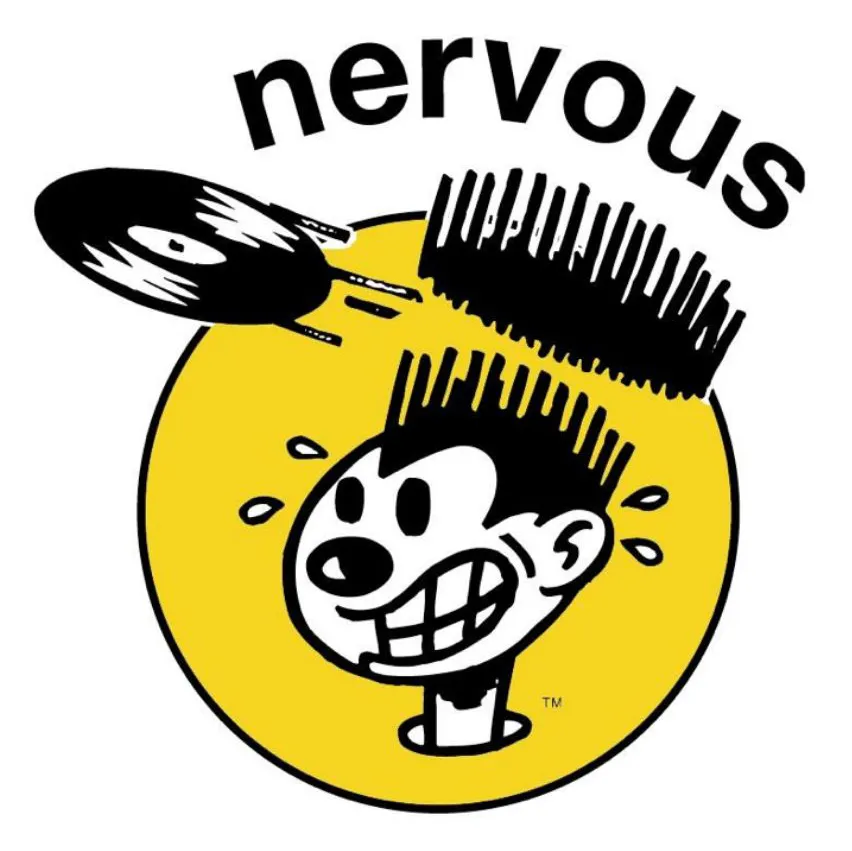
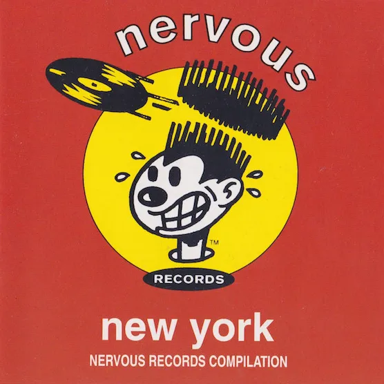
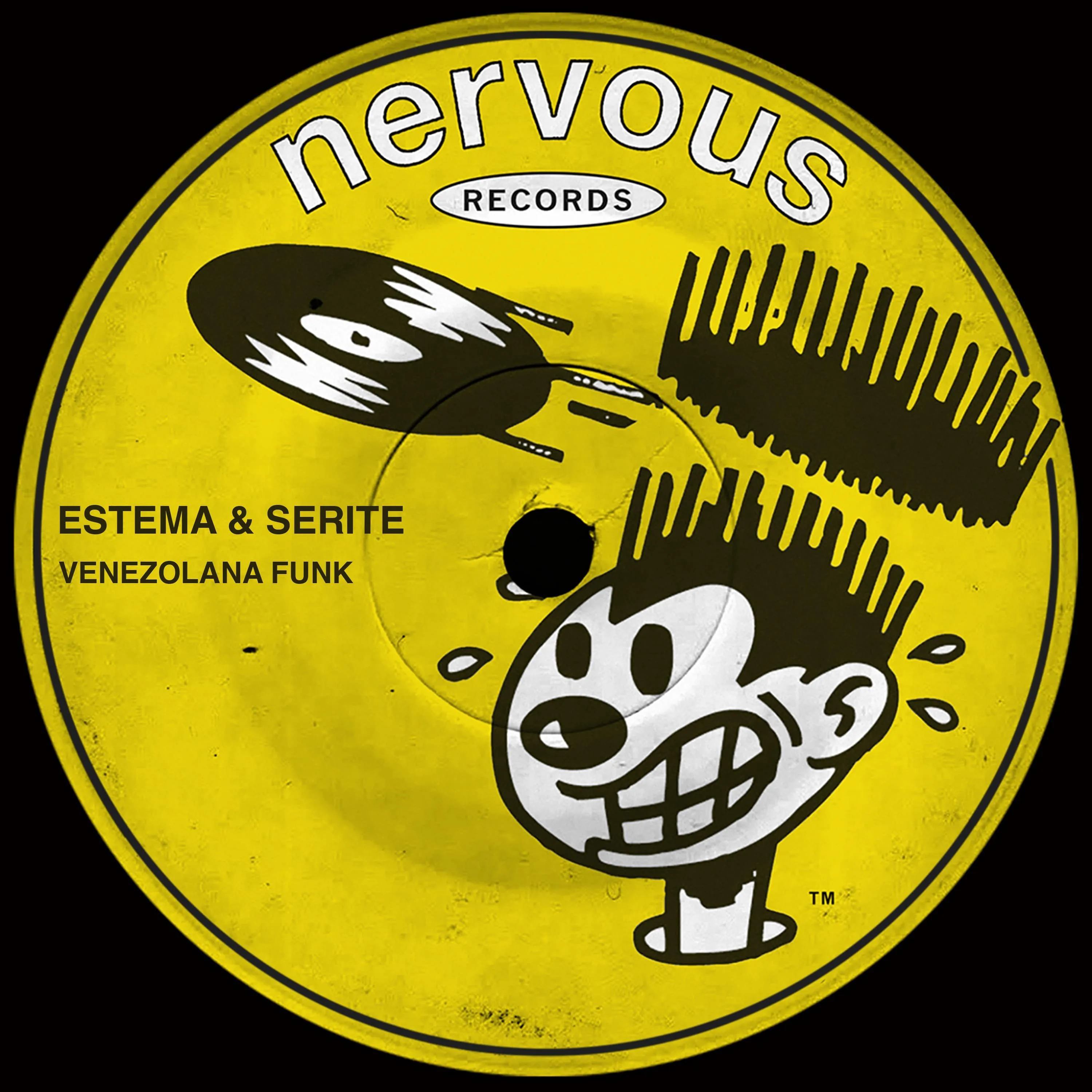
The logo Weiss commissioned for his label in 1991 also captured the frenetic energy of DJs who were eager to get hold of the newest and hottest limited-edition vinyl. “The idea was to create a parody of a superhero character in the DJ world,” says Weiss. “This was before DJs were considered the massive stars they are now. But in my world, the independent NYC dance label scene, DJs and producers were our stars.”
Weiss knew an art director at EMI/Chrysalis named Marc Cozza whom he asked to design a logo. “My first and only idea was to create an iconic character that could live on its own, without even using the word ‘nervous,’” says Cozza. “I was channelling George Herriman’s Krazy Kat and also the Superwest comic books. At the time, the Arsenio Hall flat-top hairstyle was in vogue and I thought of the idea of having a speeding record buzz the top off of the character’s afro, leaving him shaking but with a perfect haircut.”
The first logo was circular, since it was designed with vinyl in mind, and used a simple sans-serif font. In 2004, Weiss had it updated to better suit the digital marketplace, making it square and setting the figure against a brick wall, with graffiti writing by Blake “KEO” Lethem “to embellish the urban aspect.” - Sue Apfelbaum
01 - Nervous Records original logo.
02 - Cover of “Nervous New York Compilation”, 1992.
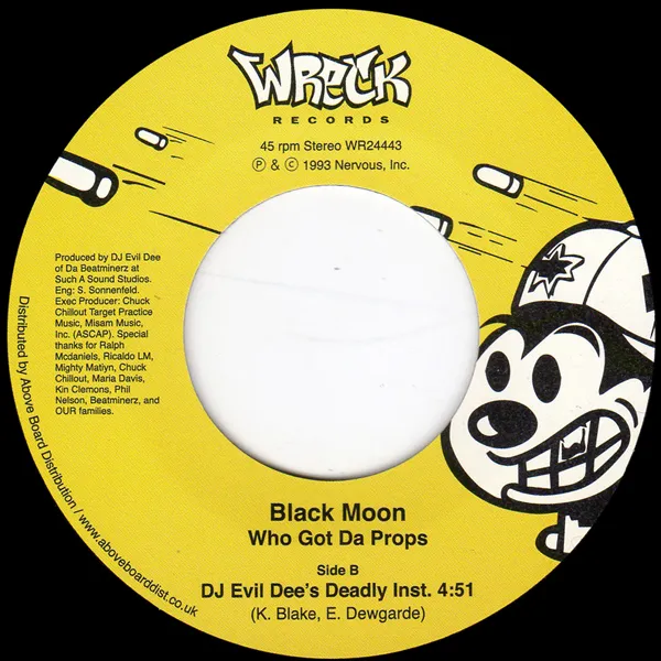
03 - Label of “Who Got Da Props”, 1993.
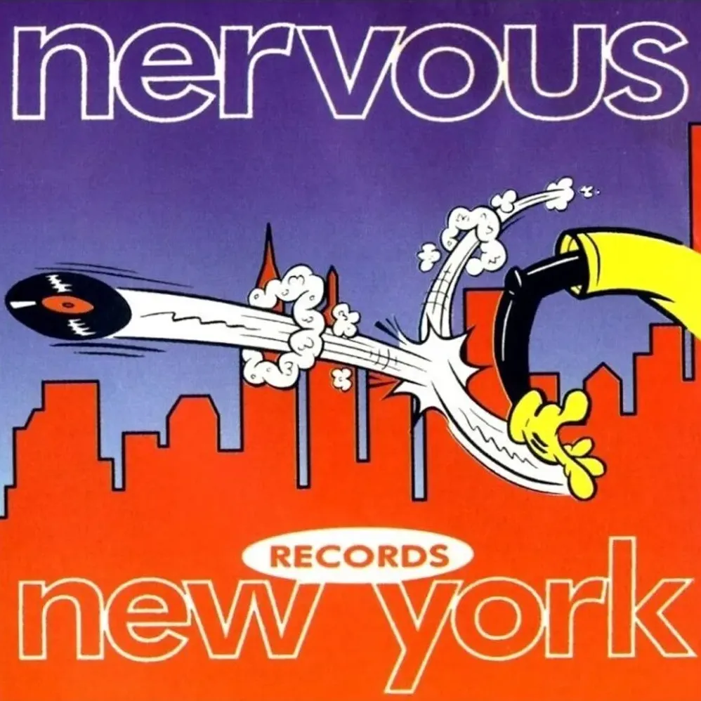
04 - Cover of “Nervous Records - The Compilation”, 1993.
05 - Label of “Venezolana Funk”, 2024.
